


Email CTAs are among the most important parts of any email marketing campaign. Once you’ve convinced a customer to click on your message with a great subject line and read your content, you can’t assume they’ll take the ideal next step (i.e., visiting your website or buying a product).
Unless you give your customers a nudge, there’s nothing to stop them from simply closing their inbox and forgetting all about you. Your Call to Action (CTA) in email marketing is how you tell your customers exactly what you want them to do next.
The only problem is that designing an effective CTA takes work. On average, email CTAs get a click-through rate of around 3-5%. That’s not terrible, but if your goal is to consistently drive more traffic and sales to your business, then you need to optimize your CTAs.
Here, I’m going to share my top tips, based on years of creating email marketing campaigns as an email marketing freelancer, to help you design the most impactful CTAs for your campaigns.
What is a CTA in Email Marketing? A Brief Overview
An email CTA (Call to Action) is a statement, phrase, or button in an email designed to persuade a reader to do something, such as book a space at your next event or visit your store, website, or product page. Here’s a quick example of one of the most common types of CTA, the CTA button:

Essentially, they’re a decorative link in your email that stands out from the rest of the page and directs customers back to your website or a specific location (like a landing page).
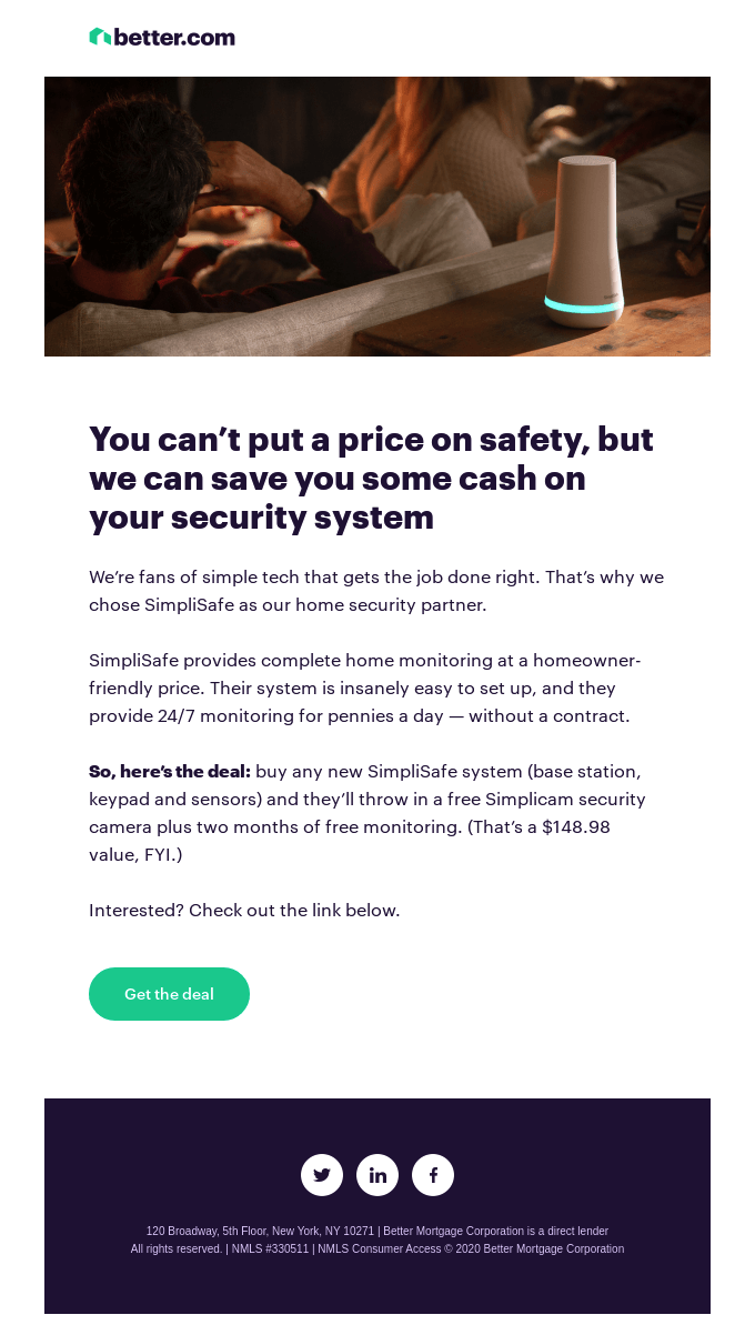
Ultimately, every email you send, aside from transactional emails (like those confirming an order), should include a CTA, or you’re running the risk of missing out on endless opportunities. CTAs make it easy to guide prospective buyers through the sales process, and ensure that your email marketing efforts are actually driving results for your overall marketing and sales strategies.
Without them, whenever you send an email, you’re just sharing content and hoping your customers will respond in the best possible way.
Top Tips for an Effective Email CTA in 2024
All of the tips I’m sharing below aren’t just effective; they’re also pretty easy to implement, particularly if you’re using the right email marketing software. Most email marketing tools will give you complete control over everything from CTA placement to button style and text.
Plus, they should allow you to save templates for future campaigns based on the strategies that work so you can save time on designing the perfect email in the future.
1. Get the Language Right: Short, Sweet, and Actionable
Let’s start with the most obvious way to create an excellent email CTA: getting the copyright. You should already know that great CTAs are short, and simple. Whether you’re using a button, or a piece of hyperlinked text, the shorter your CTAs are, the more likely they’ll be to generate results.
Notably, while a good CTA should be brief, it should also be informative and actionable. “Visit Website” isn’t particularly engaging when displayed on an email button, even if it does tell your customers what to do next. Your message should inspire someone to take action.
Try using high-power phrases that capture your customer’s attention, such as:
- Stop losing money
- Upgrade today
- Get my free trial
- Join the revolution
- Explore the collection
Here’s a great example of what a concise but actionable CTA should look like:
2. Use First-Person Language Whenever Possible
According to HubSpot, personalized CTA buttons perform up to 202% better than basic CTAs. That makes a lot of sense. Customers are bombarded with endless marketing messages every day, and they’re sick of seeing the same generic requests in their inbox.
Personalizing the CTA makes it seem like you’ve made an effort to craft the message specifically for your target customer. It helps strengthen their connection with your brand and increase trust.
One way to make your CTAs seem more personalized is to use first-person language. In other words, instead of saying, “Get your free trial,” switch it to “Get my free trial.”
This might seem a little aggressive as if you’re already assuming your customers will want to do something based on your message. However, it actually gives your customer a sense of ownership over whatever you’re offering.
Instead of feeling like they’re just not accepting an offer when it arrives in their inbox, customers feel as though they’re giving up something that already belongs to them. It’s a type of “FOMO” that works well in email campaigns.

Another option is to take advantage of the segmentation features offered by your email marketing software and use different types of CTAs for different groups. For instance, you might use more playful language in your CTAs when reaching out to younger customer groups. Alternatively, you might change something about your CTA based on a customer’s location.
3. Use at Least One CTA Above the Fold
While there are a lot of conflicting opinions out there about how to design the perfect email, most experts agree that you should always have one email CTA located “above the fold” in your message. This means ensuring your customers see a CTA button as soon as they open your email.
You don’t have to place your CTA at the very top of the page, but your customers shouldn’t have to scroll down to find it, either. This is important because most people will only read emails for about 15-20 seconds. There’s a good chance most of your customers won’t scroll to the bottom of the message.
Positioning your email above the fold ensures it will be one of the first things that capture’s your customer’s attention. You can always include another CTA further down the page, for people who do read everything, and don’t want to scroll all the way back to the top to click on something.
4. Match the CTA to the Message
In the world of PPC marketing, it’s a common golden rule to ensure that your ad copy matches whatever is on the landing page you want your customers to visit. However, in email marketing, companies don’t always “match” their CTAs to the content.
Sometimes, this can create a sense of disconnect that makes the overall email feel a little less professional. Matching your CTA to your message, on the other hand, makes it feel more relevant and engaging. Here’s a great example from Banana Republic to show you what I mean:

The purpose of the campaign is to showcase the “fresh” new styles on offer from the brand. The email itself introduces the concept of the “fresh effect” while the CTA button matches this concept with the “Get Fresh” wording. Notice how everything feels perfectly tied together?
You don’t necessarily need to use the exact same language in your header or subject line as you do in your CTA. However, creating an obvious link between your message and what you’re asking your customers to do is a great strategy.
5. Make the Most of White Space
Have you ever received an email where all of the content feels mashed together, as though the company has run out of space in their template? It doesn’t just look unprofessional; it also creates a sense of visual clutter that makes it hard for customers to focus on anything in particular.
White space is the best way to eliminate this problem. Including plenty of white space around your CTA button or text ensures that it’s not competing for attention with anything else. It also gives your customers a better experience reading your email, by making the template more legible.
Here’s an example from Airbnb to show you what a great use of white space looks like:

Keep in mind, white space doesn’t have to be “white”. You can still use all of the standard colors you’d typically use in your email backgrounds to showcase your brand. The key to success is making sure there’s enough “negative” space between email sections, and your CTA button.
6. Use Contrasting Colors
This is a CTA best practice you should be applying everywhere, whether it’s in your email marketing campaigns, or your landing pages. While it might seem like a good idea to create a consistent aesthetic with your email color palette, using the same shades for everything means your CTAs are more likely to blend into the background.
As an example, the bottom of this email from J Crew looks pretty. It matches the overall theme of the rest of the message perfectly, but the buttons don’t stand out.

There are a few problems with this approach. First, you risk your customers completely missing your CTA links. Secondly, even if they see your buttons, they might not be able to differentiate between your call-to-action links and the parts of your email they can’t click on.
There’s no one-size-fits-all strategy for choosing the right colors for your CTA buttons. However, it’s always a good idea to use contrasting shades to make these components of your message stand out. Bright colors are usually a good bet, as they’re more likely to grab attention. Here’s an example from the Grow company to inspire you:

7. Don’t Include Too Many Buttons
Decision paralysis is a real thing, and it has a direct impact on how likely your customers are to “take action” when they see your email CTAs. If your emails include dozens of different links, your customers are probably going to feel a little overwhelmed. Here’s an example of an email with too many links to choose from:

Ultimately, it’s better to keep things simple. In fact, one study found that emails with 2-3 CTAs typically have the best click-through rates. Alternatively, emails with more than 3 CTAs have lower click-through rates than those with just one.
Give your customers an easy choice to make with just one button, or use a couple strategically spread throughout long emails to prevent your customers from having to scroll too much.
8. Include Different Options
I know I just said you shouldn’t give your customers too many options and CTA buttons to choose from. However, that doesn’t mean you can’t give them any options. Sometimes, including more than one CTA for different purposes makes sense.
For instance, the goal of this email from Handy is to show customers how to take full advantage of their service. To do this, they highlight two things customers can do: download an app to access mobile-only account features or change their bookings online:

Similarly, you could design an email with multiple deals for customers to take advantage of. For instance, in this message sent by “GOG,” the top of the email invites you to take advantage of a limited-time discount for a specific game:

If you scroll down a little further, you’re given the alternative option to explore other deals on similar games – just in case the first offer didn’t appeal to you.

9. Experiment with CTA Design
You might have noticed that most of the email CTA examples I’ve referenced so far look pretty similar. They might be different colors, and include different copy, but they all look like a basic “CTA button”. There’s nothing wrong with this design, but it can pay to experiment.
In some situations, it might make sense to use a text-based CTA, like Beardbrand does here.
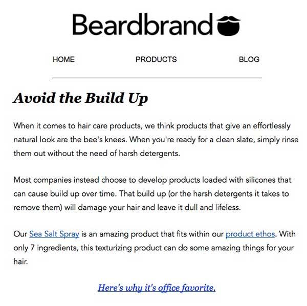
This can be particularly useful in situations where you’re promoting a blog post or article. Other times, you might prefer to switch the standard rectangle CTA button for something a little more eye-catching. This CTA button from Huemor does a great job of grabbing the attention of readers and drawing attention to the company’s unique personality.

I particularly like the “do not press” text underneath the button in the example above. It might seem risky, but it’s a great example of reverse psychology in action.
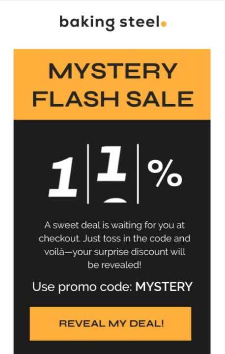
10. Create a Sense of Urgency
Fear of Missing Out, or “FOMO,” is a powerful tool in the marketing world. It can be an amazing resource to use in your email marketing strategies, whether you’re sending drip campaigns, marketing emails, or even cold messages to potential prospects.
Psychology tells us that we’re more likely to act to avoid losing something than we are to gain something. Ultimately, being told we’re going to miss out on an opportunity feels a lot worse than simply being told that the opportunity is there.
As I mentioned above, simply using “first-person” language can be enough to boost your chances of creating a sense of “FOMO” in your audience. However, you can also take this strategy a step further by using urgency in the wording of your CTA, as Chubbies did here:

It’s also worth building on the urgency with additional components in your email, such as banners letting customers know they only have a limited time to shop or even dynamic countdown timers.
11. Don’t Make your CTA Do All the Work
The right CTA in email marketing is crucial to success. It’s the only way to convince your customers to do something specific after they read your message and generate positive ROI from your campaigns. However, it shouldn’t be responsible for everything.
You can’t expect customers to open an email, see a CTA, and immediately click on it. You need to give them a valid reason to do something.
This means including the right copy around your CTA. The best copy should highlight the benefits of what you’re offering and inspire a little urgency while still getting straight to the point. Here’s a great example from Last Pass.

It immediately grabs the attention of readers with a clear heading, introduces the reason for the offer, and draws attention to the benefits that users will get by clicking on the CTA button.
12. A/B Test your CTAs
Finally, remember that experimentation is key to improving the success of your email marketing campaigns. Once you find a CTA strategy that works for you, there’s nothing wrong with retaining certain elements, such as positioning and color. However, A/B testing different CTA copy, styles, and placements can help you discover ways to enhance your ROI.
You won’t know whether “Get my 20% off” performs better than “Give me 20% off” until you test the hypothesis. Most email marketing platforms should allow you to A/B test every part of your email strategy, from your subject lines to your CTA buttons.
Take advantage of this feature, and regularly test new ideas. I particularly recommend dedicating time to A/B testing as your customer base, products, and marketing strategy evolves. New trends are emerging all the time, so usually, if you’re not moving forward, you’re falling backwards.
Optimize Your Email CTAs

<div class="btn-container"><div class="btn-body"><div>Hire The Best Email Marketers Now</div><a class="btn-body_link" href="https://portal.growthcollective.com/client/signup"</a></div></div>
An email CTA is one of the most powerful tools in your email marketing strategy. It’s the solution that helps you push customers through the sales funnel, drive more traffic to your website, and increase your sales. However, getting the best results from your CTA takes time and effort.
You need to commit to experimenting with different strategies, getting the copy, color, positioning, and surrounding content right, and finding new ways to engage your readers.
If you need help designing the perfect email marketing campaigns, A/B testing your CTA buttons, or just scaling your promotional efforts, contact Growth Collective. We can match you to an email marketing expert that will give your campaigns the boost they need.
FAQs
Should all emails have a CTA?
Any email designed to convince customers to do something, such as visit your website, download an app, purchase a product, or attend an event, should have a CTA. You don’t necessarily need to include CTAs on transactional emails, unless you need your customer to take action (such as by confirming an order, or leaving a review).
What makes a good email CTA?
An effective CTA should be short, eye-catching, and engaging. It needs to include an effective action verb that tells customers what to do next and should include language that sparks a sense of urgency or fear of missing out in your target audience.
How many CTAs should be in an email?
Most marketing emails should include at least one CTA. You can include 2-3 CTAs in each email if you want to draw attention to different offers or prevent customers from having to scroll from the bottom to the top of a message. However, avoid including more than 3 buttons or links.


